covid-notebook
Python notebooks for Swedish Covid-19 data
Notebooks for analysing Covid-19 deaths reported by FHM and total mortality from SCB.
You can view the most useful charts directly on:
- Covid-19 statistics (updated weekdays at 15:20)
- Excess mortality (updated on Mondays)
Reporting Lag
Based on data published by FHM and processed by @adamaltmejd.
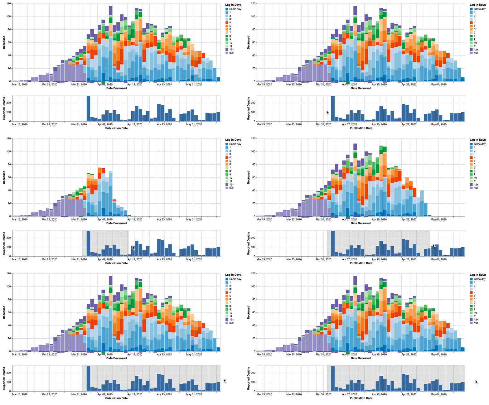
Daily reported deaths
 Interactive graph of daily deaths. Click and drag in bottom graph to select a time period for reported deaths to show in the upper graph.
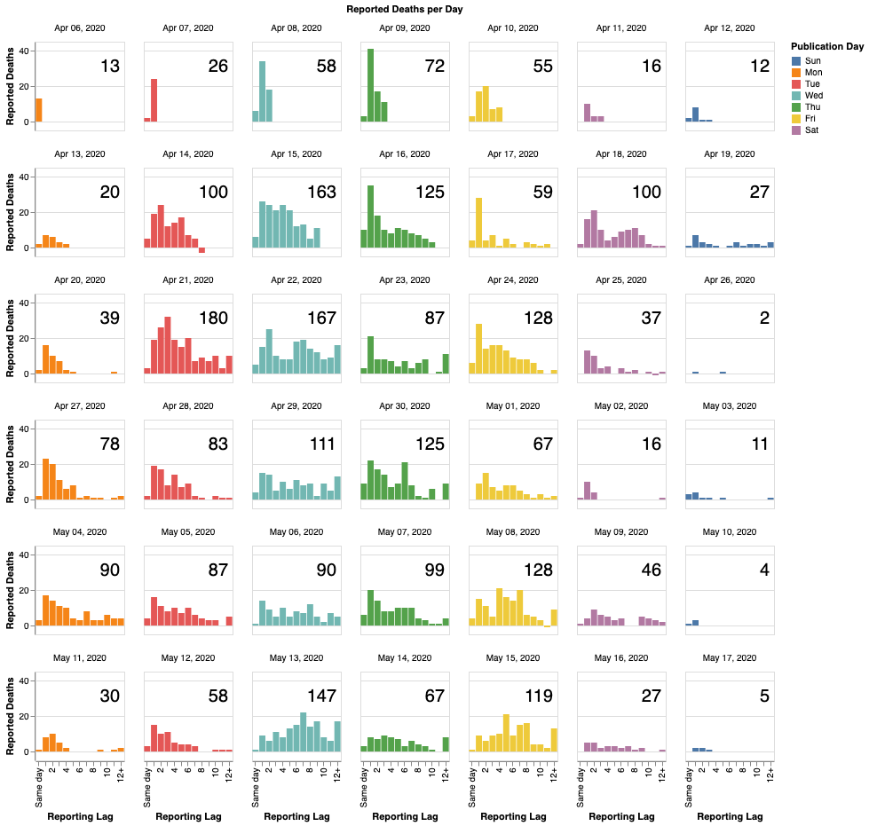
Daily reported deaths
Histogram of reporting lag for each reporting day. Column is weekday. Number is number of deaths reported that day.
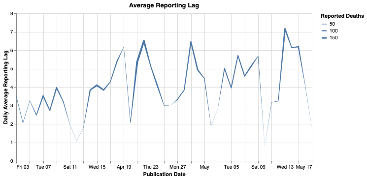
Average lag by reporting date
Average lag by reporting date. Line size is number of deaths reported each day.

